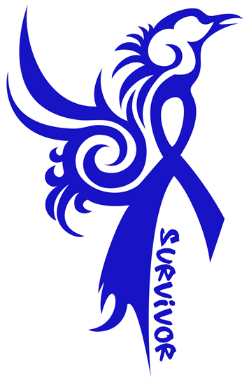
Designing Hope began when my very first freelance design client (and now extraordinary friend) finished his battle with colon cancer and wanted a tattoo to sum up his fight. I jumped on it. The image was screaming in my head so loud that I couldn’t ignore it. A tribal phoenix rising from the cause support ribbon in the blue support color. I had been by his side from the beginning of his fight and watched him as he went from getting the devastating news to rising above everything and eventually raising thousands of dollars for colon cancer research and becoming a public speaker and advocate for the cause. He was the epitome of a phoenix.
When the design was done, I posted it to Facebook for my friends and his friends to see and judge if this would be a good tattoo for him or not. A voice that I wasn’t expecting to emerge from the crowd, private messaged me to tell me how much she loved it. It was my cousin. My beautiful, successful, owns-her-own-law-firm, singing-voice-of-an-angel, has-a-loving-husband-and-daughter cousin, who, just weeks before, was diagnosed with breast cancer and facing a double mastectomy and six months of chemo treatments. My heart broke for her. I told her that she was getting a pink version of the tattoo for herself. Eventually, we turned it into a progress bar. With every major achievement in her progress, I would add more pink to the tattoo design and show it to her. Along the way she asked me if her husband could put it on a shirt for her so that she could have it always. She said that just seeing it gave her strength. So, with that simple request, a makeshift version of a CafePress store was born. I called it Designing Hope. It seemed to fit.
 It wasn’t long after that, maybe a night or two, that I was researching the colors of the ribbons to see what other cancer causes my phoenix tattoo might be good for. Cruising along in my support ribbon research I was hit smack in the face with a word I knew very well. Fibromyalgia. “I have a ribbon?” I remember thinking. It was a very odd feeling. A cross between indignant pride rejecting the idea and total and utter comfort. I had a ribbon. This meant that I wasn’t alone. This meant that this awful illness that I was struggling with was not something that I had to ignore and stay quiet about. I HAD A RIBBON! The more I said it, the more the empowerment surged through my veins. Suddenly my research shifted from cancer to fibro. I wanted to know just how far this went. Page after purple page, I found that fibro fighters were everywhere. Not only was there a ribbon, but there was a symbol too – a butterfly. I was baffled. What did a butterfly have to do with Fibromyalgia?
Diving back into my search engine I tracked down the rational behind the butterfly symbol. It turned out that the butterfly was being used for two reasons. The first was that many Fibro fighters, myself included, can experience high levels of skin sensitivity and even the lightest touch (like that of a butterfly) can cause great pain. (I instantly remembered all of the times I had to warn people not to touch me in the past due to some unexplained flair up.) The second is that the pain of Fibromyalgia, is never constantly in one place but rather flitting and floating around in an erratic and unpredictable path – just like the flight of a butterfly. When I thought about it, I realized a butterfly made perfect sense. I grew to love it. A butterfly became my second design to be added to the store.
Since then I have added several other designs to my Cafe Press shop – Designing Hope. The shop gives me a sense of purpose. Every time I see a sale I think to myself that someone somewhere is drawing strength in their own battle with illness. It is why I have kept the shop going and the markups at the lowest rate possible. I want others to feel what I feel, what my friend feels, what my cousin feels, when owning one of my designs – strength, empowerment, and above all – HOPE!

